Sunday, August 9, 2015

our Journey begins

I was in the mood to create a simple, but elegant wedding layout, choosing one of my most favorite photographs - my beautiful daughter with her handsome husband escorting her down stone steps as they strolled around Venice after getting married. 
I love the look on their faces!   They both look so happy and so very proud.
For me, this photo always emulates the feel that Brianne & John are beginning their lifelong journey together.  

The chipboard title was prepped with gesso; painted with white acrylic paint; and the lower half inked in teal color. For some shabby chic interest, I distress punched around the page. 
 
Prima’s elegant Décor 2 stencil and crackle texture paste were perfect for the print in the paper. Of course, Wild Orchid Crafts flowers always add so much beauty to a layout!   And so does Lindy’s Stamp Gang sprays! 
LSG Starburst Cape Cod Coral recolored a white Tuscany rose & rosebuds.  Touches of LSG Glitz Spritz Scintillating Silver with a paintbrush added a bit more sparkly-shimmer! 

The white roses and die cut leaves were sprayed with LSG SB Teeth Chattering Teal (retired color) to add a hint of teal shimmer. A few touches of the Scintillating Silver Glitz Spritz gave additional sparkle!
 
 
I always enjoy scrapping those awesome wedding photos of Brianne & John! 
Thanks for visiting and hope you have a great day!  Lisa : )

~here are a few pics (some have links) of products used on this layout ~
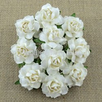
 
Wild Orchid Crafts:

http://www.wildorchidcrafts.com/index.php?main_page=product_info&cPath=28_29_14&products_id=4496
Cottage Roses

http://www.wildorchidcrafts.com/index.php?main_page=product_info&cPath=28_7_13&products_id=2442
Hip Rosebuds
http://www.wildorchidcrafts.com/index.php?main_page=product_info&cPath=28_7_74&products_id=4256
Tuscany Rosebuds


Prima:

White Crackle
Leaves
6x6 Stencil-Décor 2


Want2Scrap:

http://want2scrap.com/store/index.php?main_page=product_info&cPath=203&products_id=1752
ready-made chipboard word
http://want2scrap.com/store/index.php?main_page=product_info&cPath=1&products_id=1614
Beautiful Blooms bling
 
The Dusty Attic:

http://www.dustyattic.com.au/products.php?product=mini-ABC-set-lower
mini ABC lowercase set
 
Products used:
DCWV – The Luxury Stack collection
Cardstock – white linen-look
Martha Stewart punch – Swirling Lace
Prima 6x6 stencil – Décor 2
Prima Texture Paste – White Crackle
Prima die – Leaves
   ~White Tuscany Rose 30mm (MKX-619)
   ~Ivory Tuscany Rosebuds (MKX-627)
   ~White Cottage Rose (MKX-683-25mm)
   ~White Hip Rosebuds (GST-020)
   ~Starbursts – Cape Cod Coral & Teeth Chattering Teal (retired color)
   ~Glitz Spritz – Scintillating Silver
    ~Bling Border by Nina Brackett - Beautiful Blooms
    ~Chipboard word “Journey”
The Dusty Attic - mini ABC lowercase (DA-0862)
Hobby Lobby – white trim; Acrylic Paint – wicker white
Michael’s – peach colored brad; Studio G pigment ink - aqua 

Tuesday, August 4, 2015

Edouard

Amazing how this cart consisted of a single seat with no back support and two large wheels harnessed to a horse.  WOW!  The horse looks well fed which makes me feel a lot better.   I thought this was a very cool photo (circa 1940’s) and wanted to give this working horse a little glory!  
This was my maternal Great Grandfather, Edouard.

 
The layout needed to have a vintage look and feel, so I chose plain craft paper. The edges were distressed, rolled and folded.  A distress design was stamped all around the edges and in random areas of the page.  I was so inspired by Pascale Bernard’s gorgeous layout Saint Cosmes Church that I got brave and lightly applied black gesso with a coarse sponge.  She is a source of many inspirations for me!  I LOVE this technique!  Lastly, I stenciled splatters using distress ink Vintage Photo. 
  
I added my favorite color, purple, to the vintage color palette. I love how it looks!
Here is a close up of the die cut title:
 
Using the same paper collection, I die cut some leaves.  Vintage Photo distress ink was used to darken them. Archival Jet Black ink around the edges, as well as scoring & folding down the center helped them to stand out and have some dimension.  Wild Orchid Crafts purple/lilac colored magnolias were the perfect choice, especially since the magnolia is Louisiana’s state flower!  Some I opened up full and others I pinched to make them more closed.  The purple tone micro beads & tiny rhinestones really added that little something extra. 
 

I had some fleur di lis embellishments in my stash and used the purple one on this layout. Another Louisiana symbol…
 
Thanks so much for taking a look and have a wonderful day!  Lisa : )
 

Products used:

The Paper Studio – Haberdashery paper collection
DCWV – 6x6 Gauze paper stack
Kaisercraft clear stamp – Distress
Stampersanonymous Tim Holtz Layering Stencil – Splatters
Sizzix Tim Holtz alpha die strip – Typeset
Spellbinders Shapeabilities – Foliage
Wild Orchid Crafts – Purple/Lilac Magnolias (QVR-075)
Misc:
Distress ink – Vintage Photo
Archival ink – Jet Black
Fiskars rounder corner punch
EK Success Jolee’s Boutique – Fleur di Lis
Michael’s – purple & champagne stem balls;Fuschia microbeads; tiny purple rhinestones
Burlap sprayed with Lindy’s Stamp Gang Moonshadow Mist Pegleg Pete Purple
Coarse sponge
Black Gesso

Monday, July 27, 2015

Leather and Lace

This layout was a long time coming. 
My beautiful daughter and handsome son-in-law married in Venice, Italy in December, 2011.  Near the end of the photo session, my daughter was very cold, so she put on her leather jacket over her very feminine, gorgeous wedding gown.  How cool is that? 

I ordered the custom chipboard title from Want2Scrap quite a while back with this specific photo in mind.  After acquiring the gorgeous Prima Timeless Memories paper collection, I was ready to move forward creating! 

I wanted the title to stand out so I inked it with chestnut brown color and then topped it with crackle.
 
I really love the soft pastel, grunge of this paper, so I decided to not do anything to change that. The peachy-terra cotta colors of the buildings in the photo resonate perfectly in the colors on this paper. Everything is simply glued in place, allowing this gorgeous paper to be the ready-background. 
Lindy’s Stamp Gang Starburst color Cocklebells Coral was used to color snippets of lace and add shading around the photo, hearts and flowers.
 
The title inspiration is from the song “Leather and Lace” by Stevie Nicks.  Of course I had to include the lyrics because they are so beautiful!
 
The exceptionally cute hearts & heart outlines are from The Dusty Attic.  I chose a muted tone for them with Lindy’s Stamp Gang embossing color Sunrise Salmon Gold. 
 
Look how perfectly these beautifully detailed Wild Orchid Crafts mulberry peach roses match the color theme!
 
Thanks for stopping by and have a wonderful day!  Lisa : )

Products used:

PrimaTimeless Memories collection – page name: Freedom

Martha Stewart punch Cherish
Want2Scrap - custom title
The Dusty Attic Small Heart Attack Panel #2  (DA-1204)
Wild Orchid Crafts flowers:
   ~Peach/Orange Cottage Roses (QVR-044-25mm)
   ~Peach/Orange Hip Rosebuds (GST-019)
   ~Pale Peach Open Roses (MKX-018-20mm)
Prima flower – Chantelle Medallion (white fabric lace)
Recollections flower faux leather & leaf
Lindy's Stamp Gang:
   ~Starburst spray Cocklebells Coral (soft peachy coral with soft gold shimmer)
   ~Embossing powder Sunrise Salmon Gold
Pigment ink - Chestnut
Ranger Inkssentials - Crackle accents

Monday, July 20, 2015

summer of '49

It was July 1949 when my beautiful mother was nearly 19 years old. 
Look at her posing pretty for the camera! What an awesome photo to scrap!
 
The beautiful colors of blush/mauve, teal & beige in this paper, as well as the faded diamond pattern, were my inspirations for this layout. Lindy’s Stamp Gang’s gorgeous color Bodacious Blush was used to spray & splatter the page; recolor the lace & open roses; and recolor the modeling paste for stenciling (Magicals set Totally 80's).
I used Distress ink color Vintage Photo to outline each letter and number of the die cut title to help it pop off the page.  I made two paper flowers (one placed next to the title) using the smallest flower on the Sizzix Tim Holtz Florals die.
 
The adorable Vintage purse size emery boards were a token gift I gave my mother in 2012.  She always kept her nails in shape and loved to use emery boards; usually carrying one in her house dress pocket.  This little gift was still in her purse when she passed away.  So, I waited for the right time to use it on a layout…and this was it! 
 
I tried something different and used a white paint pen & a ruler to draw a frame directly on the photo.  I really love the result!  
 
The cute little doilies were layered using teal colored paper offset slightly under the white.  I learned this from talented artist and good friend, Tracy Funk.  Check out the gorgeous layouts she creates with dies! 

I applied gold wax to the resin bicycle so it would coordinate better with the colors in this LO.  Wild Orchid Crafts white rosebuds were recolored using LSG Starburst color Shabby Turbine Teal. 
Thanks so much for dropping by and have a great day!  Lisa : )
Products used:

Prima – Timeless Memories collection – page name: Moments
Martha Stewart punch – French Scroll
TCW 6x6 Template – Harlequin
Lindy’s Stamp Gang Starbursts – Bodacious Blush & Shabby Turbine Teal
Lindy’s Stamp Gang Magical – Bodacious Blush (in the Totally 80’s Magicals Set)
Sizzix dies:
   ~Sizzlits retired dies Endless Love
   ~Tim Holtz BigZ die Tattered Florals
My Favorite Things Die-namics dies – Mini Doily Circles
Flowers:
   ~Wild Orchid Crafts rosebuds (GST-003-6mm)
   ~Prima – Lil Missy #571658 Z& #571672
   ~Prima – Aran Fabric Flowers – Taj Blue
Misc:
Hobby Lobby – lace; resin bicycle
Michael’s – hand mirror charm; beige leaves; open roses; white paint pen
Viva Décor Inka Gold – Old Gold
Liquitex – Professional Flexible Modeling Paste
Distress ink - Vintage Photo
TCP Studio – Grandma’s Attic mini jewels 

Thursday, July 16, 2015

My Gladiolas

Here is a simple layout that I created for my Flower Scrapbook.  I took the photos in June 2010.  It was a very healthy year for my gladiolas!  These are two of my most favorite photos of them.  They are the prettiest light pink with magenta edges and gorgeous yellow centers.  
 
I let the design in the paper be my guide and decided not to do too much decorating.  Like all of my flower layouts, it’s about the photos for me to look at and reminisce in the years to come.
I found a cute 3D sticker of a singing Robin on a branch in my stash.  It gave me the idea to ‘hang’ the larger bird cage using pearlescent blue embroidery thread. 
I did some simple embossing in white with shadings of blue on the bird cage:
 
I emboss-painted the wooden flowers by using a yellowish color for the centers and baby pink on the petals, leaving a small outer edge for magenta colored pigment ink (in an attempt to mimick the colors if the gladiolas). Clear tiny rhinestones added some bling to the centers. 
 
Since the printed bird cage on the paper has jewels hanging from the bottom of it, I decided to add a couple of pink beads to hang on the other bird cage that I embossed in white and made the bird blue.
 

Thanks for looking and have a great day!  Lisa : )
 
Products used:
 
Pink Paislee Spring Jubilee collection – page named Bash & a fussy cut of the bird with the crown
Michael’s – wooden flowers & bird cages
Martha Stewart punch – Vintage Floral
EK Success – glitter number stickers
K&Company Susan Winget – Robin on a branch
Embossing:
   Recollections – Snow
   Stampendous! – Blushing Pink
   Lindy’s Stamp Gang – Dandelion Yellow Green & Morning Glory Azure
Pigment inks – Pink & Magenta

Friday, July 10, 2015

Reach ~ Find

I selected a couple of photos that I took in September 2014, during a visit to my parents’ grave, to create a layout with.  This is the statue of Jesus looking up to Heaven that is right by their grave.  The frame I made using Prima wire thread encompasses the same hand in both photos.  The close up photo was taken on the other side of the statue at an angle from below.
 
The page named "Antiquity" in the Bo Bunny Somewhere in Time collection was the perfect teal color I was looking for! It’s a green-teal; not a blue-teal, although in my layout photo it appears more bluish.
 
I started by applying a light coat of gesso; then stamped a crackle & a script design with Archival black ink; stenciling was done and then splatters of white & black gesso near the photo area. 
 
The flowers and the black stamens are from Wild Orchid Crafts.  I recolored white magnolias with Lindy’s Stamp Gang Starburst spray Jack in the Pulpit Teal.  It is a beautiful, very green teal!  I also enhanced the color of the black roses using LSG Flat Fabio spray Toto’s Tornado Black.

Here are the flower clusters up close:


I really enjoyed scrapping these photos and I hope you enjoyed viewing my layout! 
Have a great day!  Lisa : ) 

Products used:
Bo Bunny Somewhere in Time collection – page name: Antiquity
Kaisercraft clear stamp – Crackle
Bo Bunny clear stamp – Powder Mountain (script)
Prima stencil – Flourish
Wild Orchid Crafts –
   ~White Magnolias (QVR-028)
   ~Jet Black Roses (MKX-036)
   ~White Lilies (MKX-135)
   ~Mixed Pastel Cosmos Daisies – Set B (MKX-376)
   ~Mixed Red & White Sweetheart Blossoms (MKX-638)
   ~Black Double Head Pearl Stamens (MKX-571)
Lindy’s Stamp Gang – Starburst: Jack in the Pulpit Teal; Flat Fabio: Toto’s Tornado Black
Prima wire thread – Ink Black
Recollections – teal colored stick on pearls