Sunday, August 9, 2015

our Journey begins

I was in the mood to create a simple, but elegant wedding layout, choosing one of my most favorite photographs - my beautiful daughter with her handsome husband escorting her down stone steps as they strolled around Venice after getting married. 
I love the look on their faces!   They both look so happy and so very proud.
For me, this photo always emulates the feel that Brianne & John are beginning their lifelong journey together.  

The chipboard title was prepped with gesso; painted with white acrylic paint; and the lower half inked in teal color. For some shabby chic interest, I distress punched around the page. 
 
Prima’s elegant Décor 2 stencil and crackle texture paste were perfect for the print in the paper. Of course, Wild Orchid Crafts flowers always add so much beauty to a layout!   And so does Lindy’s Stamp Gang sprays! 
LSG Starburst Cape Cod Coral recolored a white Tuscany rose & rosebuds.  Touches of LSG Glitz Spritz Scintillating Silver with a paintbrush added a bit more sparkly-shimmer! 

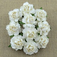
The white roses and die cut leaves were sprayed with LSG SB Teeth Chattering Teal (retired color) to add a hint of teal shimmer. A few touches of the Scintillating Silver Glitz Spritz gave additional sparkle!
 
 
I always enjoy scrapping those awesome wedding photos of Brianne & John! 
Thanks for visiting and hope you have a great day!  Lisa : )

~here are a few pics (some have links) of products used on this layout ~
 
Wild Orchid Crafts:

http://www.wildorchidcrafts.com/index.php?main_page=product_info&cPath=28_29_14&products_id=4496
Cottage Roses

http://www.wildorchidcrafts.com/index.php?main_page=product_info&cPath=28_7_13&products_id=2442
Hip Rosebuds
http://www.wildorchidcrafts.com/index.php?main_page=product_info&cPath=28_7_74&products_id=4256
Tuscany Rosebuds


Prima:

White Crackle
Leaves
6x6 Stencil-Décor 2


Want2Scrap:

http://want2scrap.com/store/index.php?main_page=product_info&cPath=203&products_id=1752
ready-made chipboard word
http://want2scrap.com/store/index.php?main_page=product_info&cPath=1&products_id=1614
Beautiful Blooms bling
 
The Dusty Attic:

http://www.dustyattic.com.au/products.php?product=mini-ABC-set-lower
mini ABC lowercase set
 
Products used:
DCWV – The Luxury Stack collection
Cardstock – white linen-look
Martha Stewart punch – Swirling Lace
Prima 6x6 stencil – Décor 2
Prima Texture Paste – White Crackle
Prima die – Leaves
   ~White Tuscany Rose 30mm (MKX-619)
   ~Ivory Tuscany Rosebuds (MKX-627)
   ~White Cottage Rose (MKX-683-25mm)
   ~White Hip Rosebuds (GST-020)
   ~Starbursts – Cape Cod Coral & Teeth Chattering Teal (retired color)
   ~Glitz Spritz – Scintillating Silver
    ~Bling Border by Nina Brackett - Beautiful Blooms
    ~Chipboard word “Journey”
The Dusty Attic - mini ABC lowercase (DA-0862)
Hobby Lobby – white trim; Acrylic Paint – wicker white
Michael’s – peach colored brad; Studio G pigment ink - aqua 

Tuesday, August 4, 2015

Edouard

Amazing how this cart consisted of a single seat with no back support and two large wheels harnessed to a horse.  WOW!  The horse looks well fed which makes me feel a lot better.   I thought this was a very cool photo (circa 1940’s) and wanted to give this working horse a little glory!  
This was my maternal Great Grandfather, Edouard.

 
The layout needed to have a vintage look and feel, so I chose plain craft paper. The edges were distressed, rolled and folded.  A distress design was stamped all around the edges and in random areas of the page.  I was so inspired by Pascale Bernard’s gorgeous layout Saint Cosmes Church that I got brave and lightly applied black gesso with a coarse sponge.  She is a source of many inspirations for me!  I LOVE this technique!  Lastly, I stenciled splatters using distress ink Vintage Photo. 
  
I added my favorite color, purple, to the vintage color palette. I love how it looks!
Here is a close up of the die cut title:
 
Using the same paper collection, I die cut some leaves.  Vintage Photo distress ink was used to darken them. Archival Jet Black ink around the edges, as well as scoring & folding down the center helped them to stand out and have some dimension.  Wild Orchid Crafts purple/lilac colored magnolias were the perfect choice, especially since the magnolia is Louisiana’s state flower!  Some I opened up full and others I pinched to make them more closed.  The purple tone micro beads & tiny rhinestones really added that little something extra. 
 

I had some fleur di lis embellishments in my stash and used the purple one on this layout. Another Louisiana symbol…
 
Thanks so much for taking a look and have a wonderful day!  Lisa : )
 

Products used:

The Paper Studio – Haberdashery paper collection
DCWV – 6x6 Gauze paper stack
Kaisercraft clear stamp – Distress
Stampersanonymous Tim Holtz Layering Stencil – Splatters
Sizzix Tim Holtz alpha die strip – Typeset
Spellbinders Shapeabilities – Foliage
Wild Orchid Crafts – Purple/Lilac Magnolias (QVR-075)
Misc:
Distress ink – Vintage Photo
Archival ink – Jet Black
Fiskars rounder corner punch
EK Success Jolee’s Boutique – Fleur di Lis
Michael’s – purple & champagne stem balls;Fuschia microbeads; tiny purple rhinestones
Burlap sprayed with Lindy’s Stamp Gang Moonshadow Mist Pegleg Pete Purple
Coarse sponge
Black Gesso