Saturday, January 31, 2015

This Magic Moment

Welcome to my blog!
I love photographing my flowers and scrapping them, so today I am sharing a LO using a photo taken on a beautiful September day in 2014 of my Trailing Blue Daze Evolvus. They are in a vintage planter that sits on top of a sandstone boulder in my front garden.

While applying a white vignette edge to my photo, I noticed a little "visitor" that I had not seen before, even when I was taking the photo!  Out of all the photos taken this day, only this one....as my good friend, Tracy Funk My Funky Scrapbook Blog, said.....was photo bombed (LOL)!
The title is because it truly is a magical moment discovering this little lizard in my photo!

I wanted a rustic feel, so I opted to use corrugated cardboard as my photo frame, which is an inspiration solely from Lisa Gregory What a Beautiful Mess! I settled on sprays that would best coordinate with the vintage planter in the photo: Lindy's Moon Shadow Mist Van Dyke Sepia and Flat Fabio Toto's Tornado Black. Copper Diamond Dust applied to the corrugated frame and rusty colored hemp tucked underneath add to the rustic feel.

My inspiration to wrap the photo in cording/twine is from the renowned Heather Jacob Art & Life. I've had a cool looking clothing hook in my stash for quite a long time and was finally able to put it to use!  I hooked the cord and Voila!  I love the look!

Thin cardboard (from a cat food box - LOL) was used to die cut leaves that are very similar to the ones in the photo.  I first heavily sprayed with LSG Dark Chocolate Truffle; followed by LSG Van Dyke Sepia; and then rubbed a little bit of Distress Ink Black Soot.  I'm very pleased with the end result!


White manila tags were colored with LSG Dark Chocolate Truffle; then splattered with LSG Van Dyke Sepia.  I used acrylic paint to stamp detailed butterflies in a warm white color so they would really stand out.  The Dusty Attic letters are colored with Distress Ink Rusty Hinge.  A printed sticker 'magic moment' completed the title!  Here is a close up:

I changed up the mulberry paper butterfly by making its body and antennae with Prima black wire thread & added some copper Diamond Dust. 

Butterfly washi tape added some bright pops of color.  White cardstock was punched to make tiny flowers; sprayed with LSG retired Starburst Breakfast Club Blue (beautiful periwinkle with a soft purple shimmer) ~ yet another color that I wish Lindy's would bring back; and a single pearl stamen added to the centers.  I love metal embellishments, so I added a few metal brads and bottle caps.  Lastly, black gesso splatters completed my LO.  This splattering technique is an inspiration from Pascale Bernard Scrap Made in Touraine.

One more look:


I am so grateful for the inspiration I get from fellow scrappers who are so awesomely creative!  The little bits of details in a LO can really make a huge difference in the outcome.  My otherwise very plain LO turned into something that I'm content with and will enjoy looking at in the years ahead, thanks to the influence and inspiration gained from these wonderful scrappers who share their beautiful creations!
Hope you have a great day - always, Lisa : )

Products used:

Basic Grey Clippings collection - "Cotton Dress" page name
Stampabilities cling rubber stamps - Borders
Inkadinkado wood mounted stamp - Butterfly by Brenda Walton
The Dusty Attic - mini ABC Upper letters
Sizzix (Tim Holtz) BigZ die - Garden Greens
EK Success punch - mini Retro Flower
Lindy's Stamp Gang sprays:
    ~Starbursts - Dark Chocolate Truffle & Breakfast Club Blue (retired)
    ~Moon Shadow - Van Dyke Sepia
    ~Flat Fabio - Toto's Tornado Black
Tim Holtz Distress Inks - Black Soot & Rusty Hinge
Misc:
Metal clothing hook
Recollections - mulberry paper butterfly; metal floral brads
Momenta - bronze bottle caps
Cosmo Cricket  - Tiny Type sticker
Wild Orchid Crafts - white pearl stamen
Black cording
Manila tags & cardstock
Diamond Dust - copper colored
Washi Tape
Black Gesso
Warm White acrylic paint
Cardboard - corrugated & thin, solid

Monday, January 12, 2015

St. Louis Cathedral/Jackson Square ~ New Orleans, Louisiana

The posting of my new layout happens to be excellent timing because the bi-centennial of the Battle of New Orleans is being celebrated this year!  This battle, led by Major General Andrew Jackson, who later became the 7th President of the United States, against the invading British on New Orleans, was won in 1815 (Jan. 18th to be exact; happens to be my daughter's birthday!). This win had a substantial impact on the United States.

I took these photographs in April 2011 while on a trip to New Orleans with my BFF and our husbands.  St. Louis Cathedral is such a beautiful and stately structure, as you can see.  The three steeples seem to break up its perfect symmetry, however, split right down the middle and you have mirror images.  Magnificent!

Jackson Square is located in front of the cathedral.  In the center is a statue of Andrew Jackson on his horse.  The greenery and pops of red flowers are so pretty and well maintained.

Check out the Jackson Square statue & part of the Louisiana license plate on my new car:  (pretty cool, huh? )
 
The blue-gray of the Maja Design Vintage Summer Basics "1945" page was perfect for these photos.  Lindy's Stamp Gang magicals color Whale Watch Blue was mixed with modeling paste to obtain both a dark and light version of this gorgeous blue-gray color.

Stenciling with TCW's mini Gothic Romance; stamping a clock face; and splattering of white & black gesso completed the background.  Fleur de Lis die cuts on dark gray textured cardstock were stenciled & splattered to coordinate with the background.
Here is a close up of what I described above:
 
Gray textured cardstock was heat embossed with LSG Queen Sheba's Silver; then scored and the leaves folded.
 
I especially LOVE the wrought iron fence by The Dusty Attic because of the Fleur de Lis design on each post!  Heat embossed in jet black really made it stand out.  Because of our French heritage, the Fleur de Lis is widely displayed in Louisiana (including as the logo for our New Orleans Saints NFL football team).
For a very clear and protective coating, Glossy Accents was applied over the paper placed in the ornate plate. 

 
All of the flowers are from Wild Orchid Crafts.  The red Aster Daisies are the perfect color match with the flowers in the photo.  White Aster Daisies & a Carnation were sprayed with LSG Starburst Whale Watch Blue to coordinate with the page.
 
I was also very lucky to have a resin lantern & a Fleur de Lis in my stash for embellishments!

 
A few black glass beads, red stick-on pearls & black embroidery thread finished the page.
Thanks so much for stopping by for a look and I hope that you have a wonderful day!
Lisa : )
 

Products Used:

Maja Design – Vintage Summer Basics “1945”
TCW stencil – Mini Gothic Romance
Prima stamp – Printery clock
Spellbinders Nestabilities – Fleur de Lis Squares
Sizzix BigZ Tim Holtz die – Garden Greens
The Dusty Attic – Wrought Iron Fence
Tim Holtz – ornate plate
Wild Orchid Crafts – Aster Daisies & Carnation
Lindy’s Stamp Gang:
   ~Magical “Whale Watch Blue” in the Nantucket Pearls magicals set
    ~Starburst spray “Whale Watch Blue”
    ~Embossing Powder “Queen Sheba’s Silver”
Stampendous embossing powder – Black
Jolee’s 3-dimensional stickers – Fleur de Lis
The Paper Studio Spare Parts (Hobby Lobby) – resin lantern
Want2Scrap – red stick-on pearls
Misc:
    Gesso – black & white
    Modeling paste (Liquitex)
    Cheesecloth
    Embroidery thread – black
    Glass beads – black
    Pigment ink - Charcoal
    Distress ink - Black Soot
    Glossy Accents

Friday, January 2, 2015

Peace and Love

Happy New Year everyone!
To start 2015, I created a simple layout with a wonderful sentiment - Peace and Love.


I took this photo of my most favorite Jim Shore piece on a sunny day in front of my variegated rubber plant.  Jim Shore designs wonderful figurines.  His Grandmother was a Master Quilter and you can see this influence in his pieces.

I punched and then sprayed a piece of manila stock.  An overlapping of LSG Starburst sprays (both are now retired colors) Passionate Plum (plum with a silver shimmer) and Carpathian Bluebells (periwinkle with a gold shimmer) made a nice, shimmery piece to frame the photo.  Purples & blues are my favorite colors!
 
I misted Prima's stencil "Flourish" on the main page with LSG Carpathian Bluebells. 
Quite a beautiful color!
Splatters on the main LO were created using LSG Flat Fabio Magical Mai TaiThe lace piece was colored with LSG Starbursts Poinsettia Red Gold, topped with Rudolph’s Nose Red.

I created a 'shadow effect' with two pigment inks when stamping the words Peace & Love.
The edges of the LO are stamped with LaBlanche "Elegant Swirl" in a chestnut color.
The details in this stamp are stunning.
 
I decorated two matching pieces from The Dusty Attic 'Foliage' pack.  They were prepped with gesso; chalk inked with 'Amber Clay' color and the edges with 'Burnt Sienna'; layered with a color mixture of champagne, carnelian, jungle & pesto microbeads; and then topped with red seed beads.
 
Wild Orchid Crafts mulberry flowers & long grass were used to create the small flower arrangement.  The ivory calla lilies were recolored with LSG Carpathian Bluebells and the gypsophila on a stem with LSG Poinsettia Red Gold.

Thanks so much for stopping by today.  I really appreciate it!
Very best wishes to all for a healthy, prosperous 2015!  Lisa  : )
 
Products used: 

Bo Bunny – Chiffon Vintage
Prima stencil – Flourish
Wild Orchid Crafts – ivory calla lilies, gypsophila on a stem & long grass
Lindy’s Stamp Gang Flat Fabio – Magical Mai Tai
LSG Starbursts –
    ~Carpathian Bluebells (now retired)
    ~Passionate Plum (now retired)
    ~Poinsettia Red Gold
    ~Rudolph’s Nose Red
LaBlanche stamp – Elegant Swirl
Inkadinkado clear stamps – Calligraphy Expressions (words: Peace, Love)
Martha Stewart punch - Vintage Floral
Chalk inks – Red Barn, Red Magic, Chestnut, Amber Clay, Burnt Sienna, Lavender & Sky Blue
Misc: lace, gesso, microbeads, seed beads, manila stock, Recollections bling in light blue & lavender
 

Tuesday, December 23, 2014

My Christmas Cactus

Hi everyone!  I created another layout for my garden scrapbook using a photo I took in early December of my Christmas Cactus.  This plant blooms only during the Christmas season.  I am very proud of this beautiful flowering plant that belonged to my Dad.  It is because of him that I have a love for flowers & other plants.


Although this unique plant is native to Brazil, the flowers of the Christmas Cactus look Hawaiian. It grows very well here in Louisiana!
 
I always keep my garden flower scrap pages simple because I want the photo of nature’s beauty to be the full focal point.  Since it doesn’t (well, rarely) snow in southwest Louisiana where I live, snowflake embellishments just would not ‘fit’, so I chose the Prima doily die that would look the most ‘festive’ for this time of year.   Where I live, we do have ‘Fall’ (Autumn), so that is why I chose to portray the falling leaves. I also decided not to decorate this LO with other flowers, like I normally do, because the uniqueness of this Christmas Cactus flower cannot be matched.


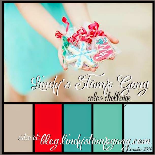
I have entered this LO in the Lindy’s Stamp Gang December 2014 challenge because the colors I chose match perfectly with their color selections this month.  Yay!  : )

http://blog.lindystampgang.com/color-challenge-info/
 
Using TCW’s mini 6x6 stencil ‘Art is’ I applied Liquitex white texture paste that I colored with LSG Magical “Queen of Hearts Red”. This deep red is part of the Mad Hatter magical set.  Isn’t it stunning against the green background?!   WOW!  You can read the stenciled words so perfectly clear : )
 
All of the die cuts were inked with Distress Ink 'Vintage Photo’. I heat embossed a few of the Prima doilies, the larger die leaves and three of the printed leaves on the Bo Bunny paper with LSG embossing powder Starbright Gold Green.  The smaller Prima die cut leaves were embossed in clear.  I really love the way the distress ink nicely shows through the embossing!
 
The stamens I used on some of the doily centers are from Wild Orchid Crafts. 
White ones were recolored into green with alcohol ink color ‘Pesto’.
 
 
Thanks so much for stopping by and I hope you have a wonderful, Merry Christmas and a very healthy & prosperous New Year!
Lisa : )
Products used:
 
Bo Bunny – Autumn Song collection “Melody”
DCWV – Old World Stack
Recollections – Floral Foliage
Prima metal dies – Doilies Two & Leaves
TCW mini 6x6 stencil – Art is
Liquitex – modeling paste
Lindys Stamp Gang ~ Magical “Queen of Hearts Red”
                             ~ Embossing Powder “Starbright Gold Green”
VersaMagic chalk ink – Red Magic
Tim Holtz distress ink – Vintage Photo
Wild Orchid Crafts – Red Stamens, Red Double Head Pearl Stamens, White Bead Berry Spray Cluster (pulled apart & separated)
Tim Holtz – alcohol ink “Pesto”
Hobby Lobby - bead strand


Saturday, December 13, 2014

cherish

Thanks so much for stopping by!  Today I’m sharing a layout of my beautiful daughter, Brianne.  She really loves and cherishes the jewelry she inherited from her Grandmother (my Mom).  Her favorite ring is the large emerald cut peridot, which is Mom’s birthstone.  The other one she is wearing is a double pearl.  Don’t they look fabulous with the studded leather wrap watch she is wearing?!  I really love this cell phone pic taken by Brianne’s husband and knew that it would make a nice scrapbook page.  : )
 

The dark mushroom color of Brianne’s shirt, coupled with the green of the peridot, became my inspirational colors for the LO.  I found varying tones of green and mushroom colors in Kaisercraft’s ‘Be-YOU-tiful’ collection.  The page named “Graceful” could not have been more perfect! 

I have been really admiring the look of distressed corrugated cardboard on a LO ever since it was beautifully exhibited by Lisa Gregory.  Her blog is full of beautiful, inspiring layouts and mini albums using corrugated cardboard.  Check out her talent at What a Beautiful Mess”.    I decided to give this a try and boy am I pleased with the effect it gave the entire LO! 

I began by choosing a corner flourish, then sizing the cardboard and photo.  I distressed the cardboard by pulling, tearing & folding the top layer, revealing the corrugate underneath; spritzing water to help ease the process.  Once I was content with the look, I sprayed the entire cardboard piece with LSG’s Starburst Rusty Lantern Lime, followed by direct sprays of LSG’s retired Starburst color Saxifrage Olive Copper.  Even though this spray was described as brownish olive with a copper shimmer, the copper is really the more prominent color. I think it looks great with the greens and mushroom colors!  

Next, I stamped musical scores in black.  Then I mixed some acrylic paints in browns & black to achieve a dark mushroom color (I’m actually shocked, but proud of myself for guessing the right mixture of colors – LOL!).  I stamped distressed diamonds using this paint mixture.   

Mixing more acrylic paints together in browns and gray to achieve a light mushroom color, I painted all of the chipboard pieces, after first prepping them with gesso.  Distressed Ink ‘Black Soot’ was used to outline each piece and inks ‘Dark Moss’, ‘Hint of Pesto’ & ‘Burnt Sienna’ were used on top for added color.  Lastly, copper wax was applied to brighten them up a bit.

Round and tube shaped glass beads in colors of green, coppery dk brown & golden were used to decorate the corner flourish and a small part of the cardboard in the lower corner.  The precious green mulberry rosebuds & the cottage rose at the top of the layout are from Wild Orchid Crafts. 

 
Check out the beautiful copper color from the
LSG retired Starburst color Saxifrage Olive Copper!
 
A pretty bronze/coppery metal filigree flower was used to balance the photo area.  The center of the flower was a plain round bead that I replaced with a light green bling brad to coordinate with the peridot ring.  This brad was trimmed in silver, so I very carefully recolored it using Tim Holtz alcohol ink 'Copper Mixative'. 
 
As an afterthought, I sprinkled LSG’s Starburst Cowabunga Copper & retired Starburst Saxifrage Olive Copper by tapping the sprayer tube all around the page (covering the photo for protection). The dots that have the olive green outline are those made by the Saxifrage Olive Copper color. Cool!
 
Well, that’s it!   Not over embellished but elegant – just like my daughter.
Thanks so much for visiting and have a great day!  Lisa : )


Products used:
Kaisercraft ‘Be-YOU-tiful’ collection – page named “Graceful”
Corrugated cardboard
Lindy’s Stamp Gang Starbursts:
    ~Rusty Lantern Lime
    ~Saxifrage Olive Copper (retired color)
    ~Cowabunga Copper
Chipboard:
    ~Want2Scrap (title word)
    ~The Dusty Attic (Corner Flourish #5)
    ~Blue Fern Studios (Blooming Flourish – just a small portion used)
Inks:
    ~Tim Holtz distressed ink -Black Soot
    ~ColorBox catseye pigment inks – Dark Moss & Burnt Sienna
    ~VersaMagic archival chalk ink – Hint of Pesto
    ~Tim Holtz alcohol ink Copper Mixative
Stamps:
    ~Kaisercraft clear stamp “Diamonds”
    ~Michael’s bargain bin wood-mounted stamp “musical score”
Wild Orchid Crafts green tone mulberry flowers – Hip Rosebuds & Cottage Rose
Glass beads
Viva Décor Inka Gold – “Copper”
Michael’s – metal bronze/copper filigree flower set; gemstone brad; metal bronze rose leaf


Friday, November 28, 2014

Chit & Josephine

Hi everyone! 
Today I’m sharing a layout of my Great-Great maternal Grandparents, Chit & Josephine Hebert, (‘He’ is pronounced like the letter ‘A’; and ‘bert’ like bear).  I don’t know the date that the photo was taken, but as you can see, apparently the original had cracked down the middle and was taped together.  This, along with the many blemishes, really maintains the vintage age of the photo.  I distressed the photo using a wire brush. I sure wish I had the original, but either way, it is way cool! 

After pondering for quite a long time trying to decide how to scrap this photo, I saw Heather Jacob’s beautiful vintage layout “LOVE YOU, which can be found on her awe inspiring blog, Art & Life.  Her influence really helped me create this layout and I was also able to use some of her techniques!  Check out her blog to discover beautiful creative art!   Thank you so much Heather for your continued inspiration!
 

Plain kraft paper is perfect for a vintage background!   The Paper Studio’s “Haberdashery” paper collection is all kraft paper, with only one side printed, so I was able to use a plain side.  From this collection, I chose prints containing jet black (black really ‘pops’ on kraft paper) and red brick tones.  The stamps & inks used on the main background are listed at the end of the post.

Here is what I did with the printed papers I chose:
  • tore & distressed black & red floral prints to go under the photo in the focal area
  • die cut oak leaves in black w/kraft colored text (oak trees are very prevalent in Louisiana)
  • made a tag shape using black floral print
  • cut a couple of wavy pieces in black floral print for edging the LO
  • cut hexagon shapes in black and red prints (applied some to chipboard)
  • printed the LO title on kraft color with tiny black printing
To start, I distressed and inked a piece of gray chipboard giving it the color of antique linen; then applied crackle just along the edges.  (Heather Jacob's technique to use a palette knife to avoid brush strokes)


After the crackle completely dried, Vintage Photo Distress Ink was used along the edges and on the crackle area to darken and enhance the cracks, wiping off excess ink (technique used by Heather Jacob).  I LOVE this effect!  I then darkened the very outer edges with Distress Ink Black Soot for a more dramatic look.  
The earth tone cosmos daisies in this close up are from Wild Orchid Crafts. 
 
Check out how awesome the crackle turned out!  Soooooo vintage!

After rummaging through my stash, I chose various metal embellishments, flowers and chicken wire chipboard to decorate with.  


Chrysanthemums from Wild Orchid Crafts were recolored using Lindy’s Stamp Gang Moon Shadow Mist Bucket o’ Blood Red.   I rubbed some Gold colored wax on the dark brown berry stem and added a gold metal Fleur de Lis safety pin.

I put together a flower cluster and hung a metal bird nest on a swivel clasp for a unique look.  A hexagon shaped chipboard was inked jet black and Antique Linen Distress Stickles applied.

The title was printed and placed inside an ornate metal plate.
 
Thanks so much for visiting and I hope you have a wonderful day!  Lisa : )

Products used:

Prima – Ingvild Bolme Distress Tool
Ranger Distress Crackle – “Clear Rock Candy”
Tim Holtz Distress Inks – “Antique Linen”, “Black Soot”, “Vintage Photo”
The Paper Studio – “Haberdashery” collection
Bo Bunny stamps – “Distressed Textures” (chicken wire & corrugated texture)
    ~used Tim Holtz Distress Inks “Black Soot” and “Vintage Photo”
Recollections cling stamps
    ~used Colorbox Pigment ink “Red Barn”
The Dusty Attic – “Chicken Wire Panel”
    ~used Tim Holtz Distress Ink “Black Soot” & Distress Stickles “Antique Linen”
Tim Holtz Alterations Die – “Tattered Leaves”
Metal embellishments:
    ~Tim Holtz idea-ology “Ornate Plates”
    ~Michael’s – Fleur de Lis safety pin; bird nest charm; oak leaf & acorns
    ~The Paper Studio Spare Parts – swivel clasp; metal clock; antique brad (used in the clock center)
Prima – “Wood Embellishments” (clock)
Floral:
    ~Wild Orchid Crafts – earth tone Chrysanthemums; brown/white mix Cosmos Daisies
    ~The Paper Studio Mixed Media – “Burlap Sunflowers”
    ~The Paper Studio Spare Parts – “Pink Vintage Paper Flowers”
    ~Hobby Lobby – brown berry spray
Lindy’s Stamp Gang Moon Shadow Mist – “Bucket o’ Blood Red”
Viva Décor Inka Gold - "Gold"