Tuesday, December 23, 2014

My Christmas Cactus

Hi everyone!  I created another layout for my garden scrapbook using a photo I took in early December of my Christmas Cactus.  This plant blooms only during the Christmas season.  I am very proud of this beautiful flowering plant that belonged to my Dad.  It is because of him that I have a love for flowers & other plants.


Although this unique plant is native to Brazil, the flowers of the Christmas Cactus look Hawaiian. It grows very well here in Louisiana!
 
I always keep my garden flower scrap pages simple because I want the photo of nature’s beauty to be the full focal point.  Since it doesn’t (well, rarely) snow in southwest Louisiana where I live, snowflake embellishments just would not ‘fit’, so I chose the Prima doily die that would look the most ‘festive’ for this time of year.   Where I live, we do have ‘Fall’ (Autumn), so that is why I chose to portray the falling leaves. I also decided not to decorate this LO with other flowers, like I normally do, because the uniqueness of this Christmas Cactus flower cannot be matched.


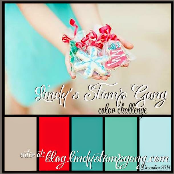
I have entered this LO in the Lindy’s Stamp Gang December 2014 challenge because the colors I chose match perfectly with their color selections this month.  Yay!  : )

http://blog.lindystampgang.com/color-challenge-info/
 
Using TCW’s mini 6x6 stencil ‘Art is’ I applied Liquitex white texture paste that I colored with LSG Magical “Queen of Hearts Red”. This deep red is part of the Mad Hatter magical set.  Isn’t it stunning against the green background?!   WOW!  You can read the stenciled words so perfectly clear : )
 
All of the die cuts were inked with Distress Ink 'Vintage Photo’. I heat embossed a few of the Prima doilies, the larger die leaves and three of the printed leaves on the Bo Bunny paper with LSG embossing powder Starbright Gold Green.  The smaller Prima die cut leaves were embossed in clear.  I really love the way the distress ink nicely shows through the embossing!
 
The stamens I used on some of the doily centers are from Wild Orchid Crafts. 
White ones were recolored into green with alcohol ink color ‘Pesto’.
 
 
Thanks so much for stopping by and I hope you have a wonderful, Merry Christmas and a very healthy & prosperous New Year!
Lisa : )
Products used:
 
Bo Bunny – Autumn Song collection “Melody”
DCWV – Old World Stack
Recollections – Floral Foliage
Prima metal dies – Doilies Two & Leaves
TCW mini 6x6 stencil – Art is
Liquitex – modeling paste
Lindys Stamp Gang ~ Magical “Queen of Hearts Red”
                             ~ Embossing Powder “Starbright Gold Green”
VersaMagic chalk ink – Red Magic
Tim Holtz distress ink – Vintage Photo
Wild Orchid Crafts – Red Stamens, Red Double Head Pearl Stamens, White Bead Berry Spray Cluster (pulled apart & separated)
Tim Holtz – alcohol ink “Pesto”
Hobby Lobby - bead strand


Saturday, December 13, 2014

cherish

Thanks so much for stopping by!  Today I’m sharing a layout of my beautiful daughter, Brianne.  She really loves and cherishes the jewelry she inherited from her Grandmother (my Mom).  Her favorite ring is the large emerald cut peridot, which is Mom’s birthstone.  The other one she is wearing is a double pearl.  Don’t they look fabulous with the studded leather wrap watch she is wearing?!  I really love this cell phone pic taken by Brianne’s husband and knew that it would make a nice scrapbook page.  : )
 

The dark mushroom color of Brianne’s shirt, coupled with the green of the peridot, became my inspirational colors for the LO.  I found varying tones of green and mushroom colors in Kaisercraft’s ‘Be-YOU-tiful’ collection.  The page named “Graceful” could not have been more perfect! 

I have been really admiring the look of distressed corrugated cardboard on a LO ever since it was beautifully exhibited by Lisa Gregory.  Her blog is full of beautiful, inspiring layouts and mini albums using corrugated cardboard.  Check out her talent at What a Beautiful Mess”.    I decided to give this a try and boy am I pleased with the effect it gave the entire LO! 

I began by choosing a corner flourish, then sizing the cardboard and photo.  I distressed the cardboard by pulling, tearing & folding the top layer, revealing the corrugate underneath; spritzing water to help ease the process.  Once I was content with the look, I sprayed the entire cardboard piece with LSG’s Starburst Rusty Lantern Lime, followed by direct sprays of LSG’s retired Starburst color Saxifrage Olive Copper.  Even though this spray was described as brownish olive with a copper shimmer, the copper is really the more prominent color. I think it looks great with the greens and mushroom colors!  

Next, I stamped musical scores in black.  Then I mixed some acrylic paints in browns & black to achieve a dark mushroom color (I’m actually shocked, but proud of myself for guessing the right mixture of colors – LOL!).  I stamped distressed diamonds using this paint mixture.   

Mixing more acrylic paints together in browns and gray to achieve a light mushroom color, I painted all of the chipboard pieces, after first prepping them with gesso.  Distressed Ink ‘Black Soot’ was used to outline each piece and inks ‘Dark Moss’, ‘Hint of Pesto’ & ‘Burnt Sienna’ were used on top for added color.  Lastly, copper wax was applied to brighten them up a bit.

Round and tube shaped glass beads in colors of green, coppery dk brown & golden were used to decorate the corner flourish and a small part of the cardboard in the lower corner.  The precious green mulberry rosebuds & the cottage rose at the top of the layout are from Wild Orchid Crafts. 

 
Check out the beautiful copper color from the
LSG retired Starburst color Saxifrage Olive Copper!
 
A pretty bronze/coppery metal filigree flower was used to balance the photo area.  The center of the flower was a plain round bead that I replaced with a light green bling brad to coordinate with the peridot ring.  This brad was trimmed in silver, so I very carefully recolored it using Tim Holtz alcohol ink 'Copper Mixative'. 
 
As an afterthought, I sprinkled LSG’s Starburst Cowabunga Copper & retired Starburst Saxifrage Olive Copper by tapping the sprayer tube all around the page (covering the photo for protection). The dots that have the olive green outline are those made by the Saxifrage Olive Copper color. Cool!
 
Well, that’s it!   Not over embellished but elegant – just like my daughter.
Thanks so much for visiting and have a great day!  Lisa : )


Products used:
Kaisercraft ‘Be-YOU-tiful’ collection – page named “Graceful”
Corrugated cardboard
Lindy’s Stamp Gang Starbursts:
    ~Rusty Lantern Lime
    ~Saxifrage Olive Copper (retired color)
    ~Cowabunga Copper
Chipboard:
    ~Want2Scrap (title word)
    ~The Dusty Attic (Corner Flourish #5)
    ~Blue Fern Studios (Blooming Flourish – just a small portion used)
Inks:
    ~Tim Holtz distressed ink -Black Soot
    ~ColorBox catseye pigment inks – Dark Moss & Burnt Sienna
    ~VersaMagic archival chalk ink – Hint of Pesto
    ~Tim Holtz alcohol ink Copper Mixative
Stamps:
    ~Kaisercraft clear stamp “Diamonds”
    ~Michael’s bargain bin wood-mounted stamp “musical score”
Wild Orchid Crafts green tone mulberry flowers – Hip Rosebuds & Cottage Rose
Glass beads
Viva Décor Inka Gold – “Copper”
Michael’s – metal bronze/copper filigree flower set; gemstone brad; metal bronze rose leaf


Friday, November 28, 2014

Chit & Josephine

Hi everyone! 
Today I’m sharing a layout of my Great-Great maternal Grandparents, Chit & Josephine Hebert, (‘He’ is pronounced like the letter ‘A’; and ‘bert’ like bear).  I don’t know the date that the photo was taken, but as you can see, apparently the original had cracked down the middle and was taped together.  This, along with the many blemishes, really maintains the vintage age of the photo.  I distressed the photo using a wire brush. I sure wish I had the original, but either way, it is way cool! 

After pondering for quite a long time trying to decide how to scrap this photo, I saw Heather Jacob’s beautiful vintage layout “LOVE YOU, which can be found on her awe inspiring blog, Art & Life.  Her influence really helped me create this layout and I was also able to use some of her techniques!  Check out her blog to discover beautiful creative art!   Thank you so much Heather for your continued inspiration!
 

Plain kraft paper is perfect for a vintage background!   The Paper Studio’s “Haberdashery” paper collection is all kraft paper, with only one side printed, so I was able to use a plain side.  From this collection, I chose prints containing jet black (black really ‘pops’ on kraft paper) and red brick tones.  The stamps & inks used on the main background are listed at the end of the post.

Here is what I did with the printed papers I chose:
  • tore & distressed black & red floral prints to go under the photo in the focal area
  • die cut oak leaves in black w/kraft colored text (oak trees are very prevalent in Louisiana)
  • made a tag shape using black floral print
  • cut a couple of wavy pieces in black floral print for edging the LO
  • cut hexagon shapes in black and red prints (applied some to chipboard)
  • printed the LO title on kraft color with tiny black printing
To start, I distressed and inked a piece of gray chipboard giving it the color of antique linen; then applied crackle just along the edges.  (Heather Jacob's technique to use a palette knife to avoid brush strokes)


After the crackle completely dried, Vintage Photo Distress Ink was used along the edges and on the crackle area to darken and enhance the cracks, wiping off excess ink (technique used by Heather Jacob).  I LOVE this effect!  I then darkened the very outer edges with Distress Ink Black Soot for a more dramatic look.  
The earth tone cosmos daisies in this close up are from Wild Orchid Crafts. 
 
Check out how awesome the crackle turned out!  Soooooo vintage!

After rummaging through my stash, I chose various metal embellishments, flowers and chicken wire chipboard to decorate with.  


Chrysanthemums from Wild Orchid Crafts were recolored using Lindy’s Stamp Gang Moon Shadow Mist Bucket o’ Blood Red.   I rubbed some Gold colored wax on the dark brown berry stem and added a gold metal Fleur de Lis safety pin.

I put together a flower cluster and hung a metal bird nest on a swivel clasp for a unique look.  A hexagon shaped chipboard was inked jet black and Antique Linen Distress Stickles applied.

The title was printed and placed inside an ornate metal plate.
 
Thanks so much for visiting and I hope you have a wonderful day!  Lisa : )

Products used:

Prima – Ingvild Bolme Distress Tool
Ranger Distress Crackle – “Clear Rock Candy”
Tim Holtz Distress Inks – “Antique Linen”, “Black Soot”, “Vintage Photo”
The Paper Studio – “Haberdashery” collection
Bo Bunny stamps – “Distressed Textures” (chicken wire & corrugated texture)
    ~used Tim Holtz Distress Inks “Black Soot” and “Vintage Photo”
Recollections cling stamps
    ~used Colorbox Pigment ink “Red Barn”
The Dusty Attic – “Chicken Wire Panel”
    ~used Tim Holtz Distress Ink “Black Soot” & Distress Stickles “Antique Linen”
Tim Holtz Alterations Die – “Tattered Leaves”
Metal embellishments:
    ~Tim Holtz idea-ology “Ornate Plates”
    ~Michael’s – Fleur de Lis safety pin; bird nest charm; oak leaf & acorns
    ~The Paper Studio Spare Parts – swivel clasp; metal clock; antique brad (used in the clock center)
Prima – “Wood Embellishments” (clock)
Floral:
    ~Wild Orchid Crafts – earth tone Chrysanthemums; brown/white mix Cosmos Daisies
    ~The Paper Studio Mixed Media – “Burlap Sunflowers”
    ~The Paper Studio Spare Parts – “Pink Vintage Paper Flowers”
    ~Hobby Lobby – brown berry spray
Lindy’s Stamp Gang Moon Shadow Mist – “Bucket o’ Blood Red”
Viva Décor Inka Gold - "Gold"
 

Saturday, November 22, 2014

Harvey

Hi!  Thanks for stopping in for a peek at my handsome Grand-Kitty, Harvey!
On a recent visit to my daughter in Houston, Texas, I was able to capture these special moments with him in the morning while everyone was still asleep. 
With gorgeous light chartreuse colored eyes and a beautiful gray coat that feels like velvet, we believe Harvey may be a Russian Blue Mix.  He has some white on his face & chest, as seen in these photos, as well as on all four paws and the very tip of his tail.  Cute as cute can be! 

The Maja Design Vintage Spring Basics “1st of May” paper had the PERFECT colors to coordinate with Harvey’s baby pink nose and gray coat.  Lindy’s Stamp Gang Starburst retired color “Gregarious Grey” was sprayed in some areas to reduce the amount of pink in the page.  I sure wish Lindy's would bring back this stunning color!

My first idea was to create an argyle pattern in an effort to "masculinize" the layout, but it didn’t turn out as I had envisioned, so instead, I just outlined the pattern with pink squares and decided to place the title there.  
The custom chipboard title from Want2Scrap is heat embossed with Lindy’s Stamp Gang “Spring Leaf Chartreuse”.  Natural sunlight captured the gorgeous pink shimmer of LSG's Gregarious Grey Starburst spray in the photo below.  I love the two-tone effect in the Starburst sprays!


The beautiful mulberry flowers are from my favorite UK website, Wild Orchid Crafts. 
I just received these in a recently placed order with them.   

                   Chrysanthemums (Pastel Set B)         Cosmos Daisies (Pastel Set A)
   

http://www.wildorchidcrafts.com/http://www.wildorchidcrafts.com/

Here are close-ups of pretty boy, Harvey  ^..^


Products used:


Maja Design – Vintage Spring Basics “1st of May”
DCWV – Neutral Metallic Cardstock & LeTres Chic Cardstock
LSG Starburst – Gregarious Grey (retired color)
Want2Scrap – custom chipboard title & Swirls Maxi Girl rhinestones silver
LSG Spring Leaf Chartreuse embossing powder
Recollections – Bling on a Roll & tiny white pearls
Crystal Stickers – Mosaic silver, pink & white
Tim Holtz alcohol inks – Slate, Pearl & Citrus
Wild Orchid Crafts – mulberry flowers: chrysanthemums & cosmos daisies
Martha Stewart punch – Zigzag
Pigment ink - charcoal


Thursday, November 13, 2014

Marcy

On a recent visit to see my daughter, son-in-law and of course my “Grand-kitties”, I was able to take a fabulous close up photo of Marcy!  She is the most stunning Calico I have personally ever seen.  I LOVE the thick ‘eyeliner’ she was born with around her left eye.  Isn’t it so cool?!   
 
These gorgeous colors of orange and black run along her back and her tail like they were poured over her, leaving her tummy and most of her face & legs all white.  She is super stunning!  She has an attitude, but Gwamma (that’s me) doesn’t let that get in the way of love and kisses. : )

Marcy and her best-friend/sister, Greta (85 lb German Shepherd) lived with us for many months until my daughter was completely settled and ready to bring them home with her.  I spent a lot of time getting to know little Marcy, so her growling scare tactic, even today, doesn’t deter me much.  She loves her Gwamma – no matter what she says! LOL    

I wanted to use bold colors, so I looked at my Graphic 45 Couture collection and fell in love with the page full of flowers & leaves set on a jet black background.  This became my color inspiration to show case Marcy’s vivid markings.  After seeing an impressive layout a good friend of mine recently made on a solid black background, I knew this was the way to show off Marcy’s beauty.  Thanks for the inspiration, Lorna!   

I chose 3 colors of cardstock from various collections to add some punched strips on the main page.
A few color-matching flowers, butterflies, bling and the title completed this LO.  The chipboard title and the bling are from Want2Scrap.  Using alcohol inks, a clear flourish bling became terra cotta and cute paw prints turned into pitch black.  I heat embossed the title with a verdigris color because I love the green-blue patina tone as well as the specks of black in it. 
 
Here is a close up of the mixture of stunning colors against black.  I LOVE it!
 
Thanks so much for viewing!  I sure love my Marcy and am so happy that I have this fabulous photo of her.
Have a wonderful day!  Lisa : )
 
Products used: 
Recollections – Black cardstock & ‘Habitat’ collection green paper; orange & golden bling
Graphic 45 – ‘Couture’ collection – 8x8 paper (12x12 page name: Gorgeous)
Bazzill cardstock
DCWV - ‘Mariposa’ collection cardstock
Martha Stewart – punches ‘Swirling Lace’ & ‘Cherish’
Want2Scrap – custom chipboard title; Finesse flourish bling; Paw prints bling
Ranger – Antiquities embossing powder “Verdigris’
Tim Holtz – alcohol inks “Terra Cotta” & “Pitch Black”
ColorBox Catseye pigment inks – Teal, Butterscotch, Picante
Recollections – butterfly 3D sticker
Ashland – Fall velvet butterfly
Flowers: Prima, Martha Stewart, Recollections, The Paper Studio